petek, 11. marec 2011
"Love is like a butterfly" - "Less is More" - Week 5
Tokrat še ena voščilnica za kolekcijo "Clean & Simple" za blogovski izziv "Less is More", katerega tema so bile tokrat pastelne barve. Izdelala sem voščilnico v kombinaciji rožnate, bele in črne barve. Na zgornji rob sem odtisnila prvi del verza: "Love is like a butterfly", na spodnji rob voščilnice pa drugi del verza: "It goes where it pleases and it pleases wherever it goes." Na sredino sem v obliki srca odtisnila štampiljko s pisavo proizvajalca Kaisercraft in odtis osenčila z distress blazinico v odtenku "Victorian Velvet". Na list papirja sem z distress inkom "Victorian Velvet" odtisnila motiv metuljčka iz zbirke "Utopiary" proizvajalca Inkadinkado in ga embosirala s prahom Caleidoscop. Robove sem preluknjala in jih izrezala s pomočjo tehnike rezanja, ki je sicer značilna za Pergamano tehniko izdelovanja voščilnic. Tako izrezanega metuljčka sem pritrdila na črno podlago in ga še enkrat obrezala po robovih. Na glavo metuljčka sem prilepila majhen roza biserček. Tako izdelanega metuljčka sem s 3D blazinicami pritrdila v desni spodnji kot odtisnjenega srčka.
This time another greeting for the "Cleand & Simple" collection for the "Less is More" Challenge. The theme of this week's challenge were pastel colours. I made a card in a combination of pink, white and black. On the top edge of the card I printed the first part of the saying: "Love is like a butterfly" and on the bottom edge I printed the other part of the saying: "It goes where it pleases and it pleases wherever it goes." In the centre of the card I made an imprint with a script stamp from manufacturer Kaisercraft in a black color in the shape of the heart. I shaded it with distress ink in the shade of "Victorian Velvet". With the same ink I made on another piece of a card an imprint of a butterfly from the collection "Utopiary" from manufacturer Inkadinkado. I embossed it with clear Caleidoscop embossing powder. I pierced the edges of a butterfly and cut them through with a cutting tehnique that is otherwise common for the parchement thenique. I than attached the butterfly on a black cardstock and again cut it out. On a head of a butterfly I attached small pink pearl. That way made butterfly I than attached to the right lower corner of the imprinted heart with 3D pads.
V notranjosti voščilnice sem v desnem zgornjem kotu ponovila odtis metuljčka, tokrat v črni barvi.
In the inside of the card I repeated an imprint of an butterfly in the right upper corner, this time in black color.
Upam, da vam je všeč. Želim vam lep petek in čudovit vikend!
I hope you like it. Have a nice friday and a great weekend!
torek, 8. marec 2011
"A Tree" in štirje blogovski izzivi.
Tokrat malo drugačna voščilnica kot so značilne zame, vzela mi je kar nekaj časa, sem pa zato z njo toliko bolj zadovoljna. Uporabila sem kar nekaj različnih papirjev, ki so vsi obrobljeni s šivi. Ker je moj ustvarjalni kotiček trenutno še malo manjši in v njem ni prostora za šivalni stroj, so vsi šivi narejeni ročno. Ja... kar nekaj dela je bilo z njimi. Uporabila sem naravne barvne tone, prevladujejo rjava, modra in zelena barva. Osrednji del voščilnice predstavlja iz lesa izrezljano drevesce, ki sem ga pobarvala z distress blazinicami odtenkov "Frayed Burlap" in "Peeled Paint". Na listke sem prilepila rumene in sinje modre biserčke. V lev spodnji kot sem dodala tri lesene gumbke, na katere sem pritrdila tri zelene gumbke. Trije modri gumbi zapolnjujejo desni spodnji kot, trije zeleni pa levega zgornjega. V desni zgornji kot sem dodala čestitko: "Enjoy your Day".
This time a little different card as typical for me, took me quite some time, but I am very pleased with it. I used several different paper pieces, which are all trimmed with stitches. Since my creative cotage is a little less spacious at the time and there is no room for a sewing machine, all stitches are handmade. I had quite a work to do. For the greeting I used natural color tones, dominated by brown, blue and green. The central part of a greeting card is a wooden tree which I colored with distress ink pads in shades of "Frayed Burlap" and "Peeled Paint". On leaves I attached small yellow and sky blue pearls. In the left bottom corner of the card I attached three wooden buttons and three smaller green ones on top of them. Three little blue buttons fill the lower right corner of the card and three little green ones the upper left corner of the greeting. In the upper right corner of the card I added a sentiment: "Enjoy your Day", whic is also shaded with distress ink pads.
V enakem stilu sem opremila tudi notranjost čestitke.
I repeated the same design in the inside of the card.
Čestitko bom prijavila na naslednje izzive:
- Sketch Saturday Challenge: Week #145
- Cute Card Thursday Challenge 154 - Signs of Spring
- C.r.a.f.t Challenge 2 - Mother's Day
- Totally Ladybug Tuesday - Challenge 18 - Spring Colors
petek, 4. marec 2011
Sing a song - Less is More Challenge Week 4 - 2nd Entry
Tokrat še ena voščilnica za "Less is More" izziv, katerega obvezen element so trije kvadrati. Izdelana je v kombinaciji bele in vijolične barve, s črnim odtisom pojočih ptic, ki so po delih odtisnjene v tri kvadrate na sredini voščilnice. Nekoliko drugačen je tudi format voščilnice. Slednja je namreč izrezana, tako da je motiv dejansko pritrjen v notranjost voščilnice. Vključila sem tudi verz: "Know the song in your heart and sing like no one is listening." V levem spodnjem kotu voščilnice je odtis ptičjega peresa, v desnem zgornjem pa odtis nogic dveh ptičkov.
This time I post another card for the "Less is More" Challenge of this week, for which the recipe are three squares. The card is made in a combination of white and purple color, with the black imprint of singing birds, which are split into three squares in the middle of the greeting. The design of the card is slightly different. The front of the greeting is partly cut out, so the motif is actually attached in the inside of the card but also visible on the outside. I also included the saying: "Know the song in your heart and sing like no one is listening." In the left bottom corner of the card I made an imprint of a bird feather, and in the upper right corner I made an imprint of two pairs of birds feets.
Upam, da sem še uspela ujeti rok za prijavo na izziv. :) Imejte se lepo.
I hope I still made it in time to catch the challenge. :) Enjoy your evening.
četrtek, 3. marec 2011
"God's beautiful creation" - Less is More Challenge Week 4
Odločila sem se, da izdelam še eno voščilnico iz kolekcije "Clean and Simple" in z njo sodelujem na tokratnem blogovskem izzivu "Less is More". Tema izziva so bili trije kvadrati, ki jih po želji vključiš kamorkoli na voščilnico, v kakršnikoli obliki, ki se je domisliš. Odločila sem se, da izdelam voščilnico v kombinaciji bele, rumene in rjave barve, z motivom narave. V vsakega izmed treh kvadratov sem v rjavem odtenku odtisnila del treh različnih štampiljk narave iz kolekcije "Utopiary" - proizvajalca Inkadinkado. Prazno mesto na voščilnici pa zapolnjuje verz: "God writes the gospel not in the Bible alone, but on trees and flowers and clouds and stars!", ki dizajn povezuje v celoto.
I decided to make another card for my collection of Clean and Simple greetings and once again enter the challenge "Less is More". This weeks theme are three squares. I decided to make a card in a combination of white, yellow and brown, with a nature motif. In each of the squares I made a brown imprint of a part of three different stamps from a collection "Utopiary" - manufacturer Inkadinkado. I filled the empty spot left on my card with a saying: "God writes the gospel not in the Bible alone, but on trees and flowers and clouds and stars!", which completes the whole design, graphically and semanticaly.
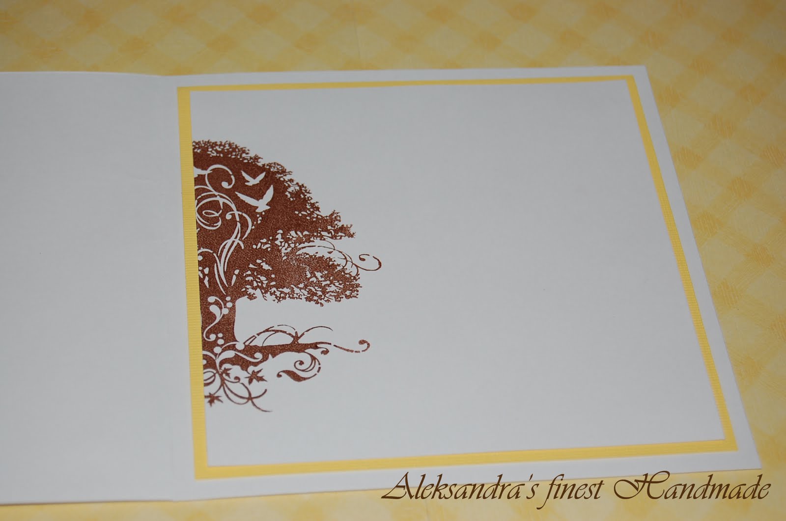
Tudi v notranjosti sem naredila rjav odtis dela drevesa iz iste kolekcije, ob notranjem robu voščilnice. Enak odtis sem ponovila na pripadajoči kuverti.
In the inside of the card I made a brown imprint of a part of the tree from the same collection, along the inside edge of the card. I repeated the same imprint on the envelope.
Veselim se vaših komentarjev in želim prijeten četrtkov večer. :)
Looking forward to all of your comments and wishing you a great thursday evening. :)
sreda, 2. marec 2011
"A Big Heart" - Forever Friends Challenge
Forever friends... tisti prikupni medvedki, ki jih enostavno moraš vzljubiti. Tokratni blogovski izziv na "Forever Friends" je bila točno določena kompozicija voščilnice. Odločila sem se, da izdelam voščilnico za zaljubljene. Uporabila sem štampiljko z Forever Friend medvedkom, ki v rokah drži veliko srce. Voščilnica je narejena v kombinaciji rdeče, modre in rjavkaste barve. Ob desnem robu voščilnice sem pritrdila izpis iz angleškega slovarja, ki pojasnjuje pomen besede "Love". Slednjega sem oblikovala v wordu, natisnila, zmečkala in nazaj poravnala, da je dobil naguban videz, nato pa sem ga osenčila z distress blazinicami. S tem postopkom sem želela doseči videz, kot da je izpis izrezan iz starega slovarja. Osrednji del voščilnice predstavlja odtis medvedka, ki sem ga pobarvala z akvareli in osenčila z distress blazinicami. Voščilnici sem dodala tudi napis: "I love you". Popestrila sem jo z sinje modrimi biserčki in tremi drobnimi krogci z motivom srčka.
Forever Friends... One of those cute little bears you just have to love. :) The theme of the current blog challenge on "Forever Friends" was a set composition of a greeting card. I decided on a love card. I used a Forever Friends stamp of a bear that holds a big heart in his hands. The greeting is made in a combination of red, blue and brownish color. At the right edge of the card I attached a print from a english dictioary that explains the meaning of the word "Love". I created the design in Microsoft Word, printed it, crumpled and again straighten it and the I shaded it with distress ink pads. That way I wanted to give it a little old look as if the piece of paper would be realy cut out of an old dictionary. The main part of the card is an imprint of a Forever Friends bear. I colored it with watercolor pencils and shaded it with distress ink pads. I added a saying: "I love you". I enriched the card with tiny blue pearls and three little beads with tiny hearts.
V notranjosti voščilnice sem odtisnila krog z napisom: "Plant a little love and watch a miracle grow." Štampiljka je iz zbirke "My Garden Set", proizvajalca "JustRite". V sredini je prostor za kratko voščilo ali zgolj podpis. Robove sem osenčila z modro distress blazinico in jih okrasila z dvojnimi izrezljanimi srci in modrimi biserčki.
In the inside of the card I made an imprint of a circle with a saying: "Plant a little love and watch a miracle grow." The stamp is from a set "My Garden Set", from a designer "JustRite". In the middle I left a space for a short personal message or just a signature. I shaded the edges with blue distress ink pads and enriched them with cut-out double hearts and tiny blue pearls.
Upam, da vam bo voščilnica všeč. Jaz sem ob izdelavi neskočno uživala. Imejte se fantastično!
I hope that you will like the card just as much as I did making it. Have fun!
Aleksandra
torek, 1. marec 2011
"Floating away" - House Mouse Challenge št. 90
Moram priznati, da so mi "Hišne miške" prav prirasle k srcu, zato sem komaj čakala nov blogovski izziv. Hvala vsem za komentarje in pohvale za design prejšnjega tedna - ne samo da polepšajo dan, temveč dajo tudi nov ustvarjalni zagon.
I must admit that "House mouse" design realy grew to my heart, so I was eagerly waiting for a new "House mouse" challenge. Thanks for all of your comments for my previous design - they realy brightened my day and gave me new creative push.
Tokratna tema izziva za "Hišne miške" je bila "Multi fold card". Tale ki sem jo naredila je bila moja prva in zato še toliko bolj vznemirljiva. Odločila sem se za voščilnico za nam drago družinico, ki se je nedolgo nazaj preselila na Irsko. Ruth, Skyler in Joshua... pogrešamo vas... Da se vrnemo k voščilnici. Izbrala sem motiv "Hišne miške - Autumn Cruise". Odtis sem pobarvala z akvarelnimi svinčniki in osenčila z distress blazinicami. Motiv je bil težji za izdelavo kakor sem pričakovala, kljub navidezni preprostosti. Tudi tokrat sem se skozi celotno voščilnico skušala držati rdeče niti, ki so bili tokrat jesenski listki. Slednje sem razporedila v krogu okoli motiva miške, ki plava na listu, v vsak iztisnjen listek pa sem dodala rumene biserčke. Voščilnico sem opremila z željami: "Many Happy Returns!" Na zgornji rob voščilnice sem pritrdila trak z lesenimi perlicami. Za ozadje sem uporabila papir z motivom jesenskih listkov, ki se ponekod blešči.
This weeks theme of the challenge was "Multi fold card". This one I made was my first and therefore even more exciting. I decided on a card for a family very dear to us that has moved to Ireland not long ago. Ruth, Skyler and Joshua... we miss you very much... Now back to our greeting. I chose a motive "House mouse - Autumn Cruise". I painted the imprint with watercolor pencils and shaded it with distress ink pads. This imprint was quite difficult for me to color, even though, at a first glance, it hadn't seemed that way. Again I tried to keep the red thread through all of the card design, which was the Autumn leaf this time. I cut leaves in a paper around the image of the house mouse and I added yellow pearls in the middle of each leaf. I included the saying: "Many Happy Returns!" On the upper edge I mounted a strap with wooden beads. For the background I used a paper with autumn leaves with some sparkles.
Enako sem opremila notranjost voščilnice. Po sredini notranjosti sem speljala dve vrvici, na kateri sem pritrdila dva lesena jesenska lista, da lahko voščilnica stoji pokončno, kar je tudi njen namen. Ker nisem želela poseči v ozadje z motivom jesenskih listkov, sem se odločila, da bo voščilnici priložen prosojen papir, ki bo vanjo le vložen in na katerega bo moč napisati voščilo.
I used the same background paper for the inside of the card. Through the middle of the inside I attached two strings with two wooden leaves, that make possible for the card to stand upright, which is also the purpose of this multi-fold. Since I didn't want to interfere in the inside background of the card with beautiful leaves, I decided to add a translucent paper to the card to write greetings on it.
Bilo je super! Bilo je zabavno! Komaj čakam na nov "multi fold" dizajn in na novo "Hišno miško". Imejte se lepo do naslednjega projekta... mogoče že jutri. Pozdravček!
It was great! It was fun! I can't wait to do another multi fold and another House mouse design. Have fun till next time... maybe already tomorrow. Bye.
sobota, 26. februar 2011
"Cheese Mouse" - House Mouse Challenge št. 89
Tale izziv "Hišne miške" sem kar nekaj časa odlagala. Ni bilo nobene ideje. Potem pa se je utrnila zamisel in počasi se je porajalo vse več dobrih idej. Izziv je bil izdelati voščilnico z najljubšo "Hišno miško". Izbrala sem miško, ki piha svečko, ki stoji na rezinah sira. Podoba mi je zares prisrčna. Izdelala sem rojstnodnevno voščilnico v kombinaciji modre in rumene barve. Skozi celo voščilnico sem skušala upodobiti koncept "sira in njegovih lukenj". Tako sem izbrala rumeno ozadje z belimi krogi, robove sem popestrila z luknjicami in jih osenčila z distress blazinicami v rumenem odtenku. Vključila sem voščilo: "Happy Birthday", ki je napisano s "cheesy" fontom. Iz fimo mase sem naredila rezinico sira, jo pobarvala in jo pritrdila k napisu.
I have postponed this "House Mouse" challenge for quite some time. I had no idea but once I got one, there was no end to it. I feel I have made a pretty god job. The challenge was to make a card with your favourite House Mouse stamp. I chose a mouse that is blowing the candle which stands on a top of cheese slices. I found the image particularly cute. So I made a birthday card in a combination of blue and yellow. I tried to capture the concept of cheese and its holes through the whole card. So I chosed a yellow background with with circles, I enriched edges with small holes and shaded them with yellow distress ink pad. I included the saying: "Happy Birthday", which is made with "cheesy" font. I made a slice of cheese from Fimo, colored it and attached it to the saying.
V notranjosti sem naredila odtis miške s svečko - seveda brez sira, ki ga je medtem že pojedla. Pobarvala sem ga z akvarelnimi svinčniki in osenčila z distress blazinicami. Robove sem okrasila z luknjicami in osenčila z distressom v rumeni barvi.
In the inside of the card I made an imprint of the mouse with a candle - of course withouth a cheese that she allready ate. I painted the imprint with watercolor pencils and shaded it with distress ink pads. I enriched the edges with small holes and shaded them with yellow distress ink.
I realy enjoyed making the card and I hope you will like it. Have a nice day and see ya.
četrtek, 24. februar 2011
"Say it with Flowers" - Penny Black at Allsorts February Challenge
Ravno za rep sem še ujela februarski izziv bloga "Penny Black at Allsorts". Tema izziva je bila "Say it with Flowers", osrednji motiv pa je moral biti iz kolekcije Penny Black. Izdelala sem voščilnico v kombinaciji roza, bele in sive barve, z odtisom motiva muce z vrtnicami, ki sem ga pobarvala z akvarelnimi svinčniki in osenčila z distress blazinicami. Dodala sem verz: "The rose speaks of love silently, in a language known only to the heart." Voščilnico sem olepšala z nekaj roza biserčki in dvema roza vrtnicama.
I barely caught the february challenge at "Penny Black at Allsorts", which runs out in a few ours. The theme of the challenge was "Say it with flowers" and the condition was to use Penny Black product as the main element of the card. I created a card in a combination of pink, white and gray color. I used the Penny Black stamp with a cat and roses and I colored the imprint with watercolor pencils and shaded it with distress ink pads. I aded a saying: "The rose speaks of love silently, in a language known only to the heart." I enriched the card with tiny pink perls and two pink roses.
Notranjost voščilnice sem olepšala z odtisom posameznih cvetov vrtnice v vsakem kotu, robove pa sem osenčila z distress tehniko.
In the inside of the card I did an imprint of roses in each of the corners and I shaded the edges with distress ink pads.
"If friends were flowers..." - Less is More Challenge drugič
Ker lahko v izzivu "Less is More" sodeluješ večkrat, le da je to z različnimi izdelki, sem izkoristila še drugo idejo, ki se mi je porodila ob izdelovanju prve voščilnice. Izdelala sem voščilnico za prijateljico v kombinaciji bele in roza barve. Uporabila sem digitalno štampiljko s spletne strani Motivet - podobo mucke, ki v gobčku drži cvetlico, ki jo je izpulila iz zemlje. Odtis je pobarvan z akvareli in osenčen z distress blazinicami. Na voščilnico sem motiv pritrdila s 3D blazinicami. V ozadju sem odtisnila drobne rožice, ki sem jih pobarvala z roza barvo. Vključila sem tudi verz: "If friends were flowers, I'd pick you!"
Since you can take part several times in the challenge "Less is More", only each time with a different card, I took adventage of yet another idea that came to my mind during the creation of the first one. So I made a card for a friend in a combination of white and pink color. I used a digital stamp design from web page Motivet - the image of a kitten that holds a flower in her mouth, which she pull out of the grass. I painted the imprint with watercolor pencils and shaded it with distress ink pads. I attached the design on the card with 3D pads. On the background I stamped small flowers and colored them in pink with watrcolor pencils. I included the saying: "If friends were flowers, I'd pick you!"
V notranjosti voščilnice sem ponovila vzorec z drobnimi cvetlicami, pobarvanimi z roza barvo, ki sem ga umestila v zgornji desni kot voščilnice.
In the inside of the card I repeated the pattern with small pink shaded flowers that I put in the upper right corner of the greeting card.
Spring Birthday - Less is More Challenge
Preproste voščilnice z malo elementi so bile, moram priznati, vedno moja šibka točka. Ravno zato mi je blogovski izziv "Less is More" toliko bolj privlačen. Morda mi bo pomagal zapolniti vrzel.
Tokratna tema izziva je bila "pomlad". Izdelala sem voščilnico v belo-zeleni kombinaciji. Uporabila sem štampiljko Penny Black "Good News" z dvema ježkoma, ki se igrata na trati posejani z rožicami, okoli njiju pa letajo čebelice. Odtis je pobarvan z akvareli in osenčen z distressi. Vključila sem tudi čestitko: "It's your spring birthday! Be happy, be joyful, spoil jourself. Enjoy your day!" Tudi čestitka je okrašena z dvema drobnima čebelicama.
Simple greetings with only few elements were, I must admit, always my weak point. That's why I found the challenge "Less is More" even more appealing.
The theme of this week's challenge was the "spring". I made a card in white and green color combination. I used Penny Black stamp "Good news" with two hedgehogs, playing on a green field with blooming flowers, and two little bees flying around them. The imprint is painted with watercolors and shaded with distress ink pads. I also included a saying: "It's your spring birthday! Be happy, be joyful, spoil jourself. Enjoy your day!" I also put two little bees around the saying.
Notranjost voščilnice sem okrasila s štirimi čebelicami v zgornjem desnem kotu voščilnice.
In the inside of the card I put four little bees in the upper right corner of the card.
petek, 18. februar 2011
A piece of my heart
Ker sem ravno v elementu in ker je moja starejša hčerkica v varstvu in imam malo več prostega časa, sem si danes dala duška pri ustvarjanju. Tokrat predstavljam poročno kolekcijo "A piece of my heart".
Since I was just in the element and my older daughter is staying with her grandparents, giving me a little extra time, I decided to create just a bit more today. This time I am presenting you a wedding collection "A piece of my heart".
Tudi tokrat sem uporabila štampiljko moje priljubljene Penny Black, z motivom dveh ježkov, pri čemer eden drži v rokah srce, ki mu manjka košček, drugi pa manjkajoči košček srčne sestavljanke. Odtis je pobarvan z akvarelnimi svinčniki in osenčen z distress blazinicami v barvnih odtenkih "Fired Brick", "Victorian Velvet" in "Antique Linen". Kolekcija je izdelana v kombinaciji rdeče, roza in bele barve. V ozadje so iztisnjeni posamezni koščki sestavljanke, ki sem jih popestrila z drobnimi biserčki.
Again I used one of my favorite stamps - Penny Black, the design of two hedgehogs, where one holds a heart that lacks a bit, and the other missing piece of a heart puzzle. The imprint is painted with watercolor pencils and shaded with distress ink pads in shades of "Fired Brick", "Victorian Velvet" and "Antique Linen". The collection is designed in a combination of red, pink and white. In the background paper are squeezed puzzle pieces, that I have enriched with tiny pearls.
V notranjosti vabila in zahvale so na levi strani posamezni koščki sestavljanke v katerih so odtisnjene posamezne besede iz besedne zveze "a piece of my heart", na desni strani pa v levem zgornjem kotu ježek s srcem in v desnem spodnjem ježek z manjkajočim delom srčne sestavljanke.
In the inside of the invitation and thank you card there are pieces of the puzzle in which there are imprinted individual words of the phrase "a piece of my heart" on the left side of the card and a hedgehog with a heart in a left top corner and a hedgehog with a missing piece in a right bottom corner of the right side of the card.
Kolekcija "A piece of my heart" lahko vsebuje vabilo, jedilni list, imenske kartice, zahvalo, konfet in scrapbook album, knjigo gostov, podobo za na torto, po želji pa tudi karkoli dodatnega, na kar se da odtisniti motiv. Predstavljam fotografije nekaterih osnovnih delov papirne kolekcije.
Collection "A piece of my heart" contains invitation, menu card, name tags, thank you card, little gifts for the guests, scrapbook album, guestbook, image for the cake and any other desired product on which stamp can be used. Bellow I present some photos of some of the basic elements of the paper collection "A piece of my heart".
četrtek, 17. februar 2011
Pretty in Blue :)
V prejšnji objavi sem predstavila voščilnico za punčke, da pa fantki in predvsem njihove mamice ne bodo prikrajšani, sem se odločila še za izdelavo modre različice. Postopek izdelave je enak, uporabljeni so ponekod malenkost drugačni materiali, namesto distress blazinice odtenka "Victorian Velvet" pa sem uporabila odtenek "Faded Jeans". Spodaj predstavljam fotografiji zunanjosti in notranjosti voščilnice.
In previous post I presented a greeting card for girls, but so the boys and especially their moms won't be disappointed, I also prepared the blue version of a card. The proces of making a card is the same, using slightly different materials and also istead of distress ink pad in shade of "Victorian Velvet" I used shade of "Faded Jeans". Below are the images of the front and the inside of the card.
sreda, 16. februar 2011
Pretty in Pink - Penny Black Saturday Challenge... Week 138
Pozdravček vsem. Za svoj prvi post objavljam fotografijo voščilnice, ki sem jo izdelala za blogovski izziv Penny Black Saturday Challenge. Tema tokratnega izziva je bila Pretty in Pink, pogoj pa je seveda, da uporabiš enega izmed izdelkov Penny Black. Pri povsem novi prisrčni štampiljki z ježkom, ki visi v mreži, razpeti med dvema cvetlicama, odločitev res ni bila težka. Odločila sem se za voščilnico za novorojeno deklico.
Hello everyone. For my first blog post I post a photo of a greeting card that I have made for Penny Black Saturday Challenge - Week 138. The theme of this week's challenge was Pretty in Pink and the only condition to fulfill was to use one of Penny Black products. The decision what to make was not hard at all, since I have a brand new Penny Black stamp with a cute hedgehog, hanging in a net between two flowers. I decided on a card for a newborn baby girl.
Odtis je pobarvan z watercolor barvicami in osenčen z distress blazinicami Tima Holza. Uporabila sem odtenke: Victorian Velvet (za senčenje roza predelov), Antique Linen (za stopala, rokice in obraz ježka), Peeled Paint (za senčenje zelenih predelov), Mustard Seed (za senčenje centra rožic in čebelice), Spiced Marmelade (prav tako za senčenje centra rožic) in faded jeans (za krilca čebelice). Voščilnico sem popestrila z gumbki in biserčki, ki voščilnici dodajo igrivost in s pesmico "o punčkah" v angleškem jeziku, katere začetna verza sta napisana na sprednji strani, preostali pa v notranjosti voščilnice.
The stamped image is colored with watercolor crayons and shaded by Tim Holz distress pads. I used shades: Victorian Velvet (pink shaded zones), Antique Linen (for foots, hands and face of an hedgehog), Peeled Paint (green shaded zones), Mustard Seed (for shading centers of flowers and a bee), Spiced Marmelade (also for shading flower's centers) and Faded Jeans (for the bee's wings). I enriched card with cute pink buttons and pink pearls, which add playfulness to the card, and with english song "about girls", of which the initial verses are written on the front of the card and the remaining part of the song is written inside of the greeting.
Notranjost voščilnice krasi odtis ježka, ki v rokah drži srce, prav tako iz kolekcije Penny Black, pobarvan v enakih odtenkih. Robove sem osenčila z distress blazinicami v odtenkih Victorian Velvet in Peeled Paint in za malo igrivosti dodala štiri roza biserčke, vsakega v svoj kot voščilnice. Zraven sem izdelala tudi pripadajočo kuverto z odtisom enakega motiva kot v notranjosti voščilnice.
The interior of the greeting is decorated with another image from a collection of Penny Black's cute stamps, a hedgehog, which carries a heart. The image is colored in same shades as the one on the front of the card. The edges are shaded with Distress ink pads in shades of Victorian Velvet and Peeled Paint. For playfulness of the card I added four pink pearls on the edges. I have also created envelope to match, with a same image as in the inside of the card.
Izziv si lahko ogledate na: http://pennybfriendssaturdaychallenge.blogspot.com/
You can access this and other Penny Black Challenges at: http://pennybfriendssaturdaychallenge.blogspot.com/
Naročite se na:
Objave (Atom)